NANAWorks
Branding & Prototyping

Project Overview
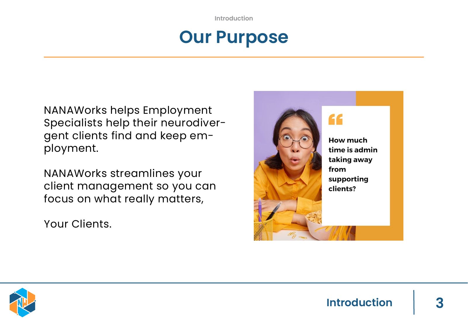
NanaWorks is a platform designed to support coaches and neurodiverse individuals as they navigate pathways toward neurodiverse employment. Because the product sits at the intersection of education, coaching, and employment, its identity needed to feel structured and professional while still being warm and supportive.
The goal of this project was to create a complete brand identity system that could support the product as it scales. Rather than designing isolated visuals, I focused on building a reusable system that establishes trust, clarity, and consistency across the platform.
Project Scope
Application Development
User Experience / Design
Branding
Applications & Tools
Adobe Illustrator
Figma
Duration
Start – September 2024
End – November 2024
Building The Brand
Objective
Designing a cohesive brand identity that communicates education, progress, and togetherness while supporting accessibility and long term product growth.

Problem Statement
Before this work, NanaWorks did not have a defined visual identity. Without a brand system, future UI and marketing decisions risked becoming inconsistent, which could undermine trust in a platform designed to support users during an already vulnerable process.
For a product serving neurodiverse individuals, visual clarity and predictability are part of the user experience. The brand needed clear rules around typography, hierarchy, and color to reduce friction and create a calm, reliable environment.

Users & Context
The brand system was designed to support:
-
Neurodiverse individuals using the platform to manage employment pathways
-
Coaches working closely with clients through structured programs
-
Internal team members designing product features and communication materials
While this project focused on brand design, the system directly impacts how users experience and understand the product.

My Role
I led the brand identity work from concept to delivery. This included:
-
Creating the NanaWorks logo from scratch
-
Defining typography and visual hierarchy
-
Establishing a color system grounded in accessibility and clarity
-
Building a structured brand guide to support consistent future use
The primary tools used were Adobe Illustrator and Figma.
Defining Brand Intent
I began by clarifying the emotional and functional goals of the brand. Three core values guided every decision: educational, working, and togetherness. The identity needed to feel instructional without being cold, and supportive without feeling informal.
This framing helped ensure that the brand communicated progress and collaboration rather than pressure or performance.
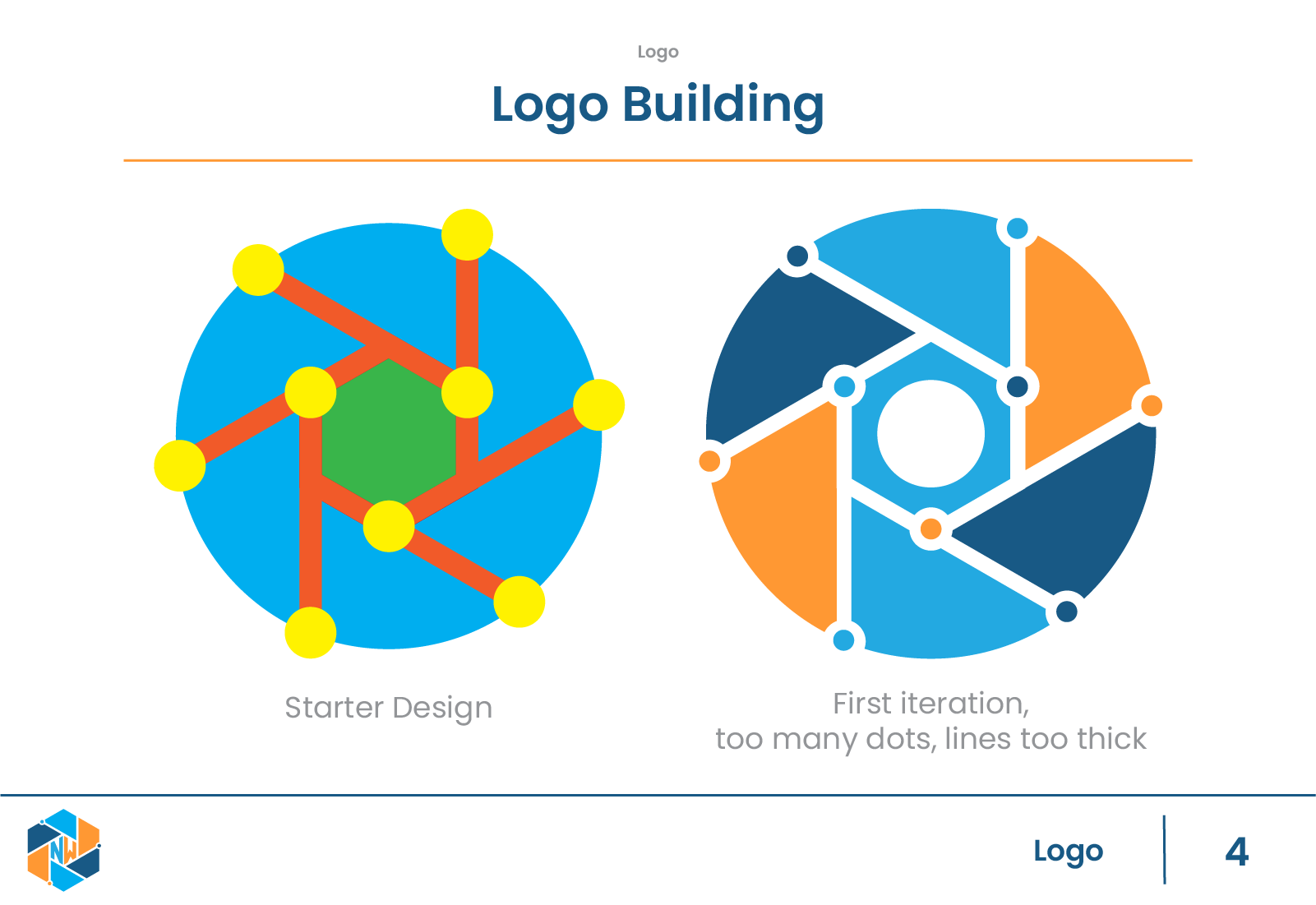
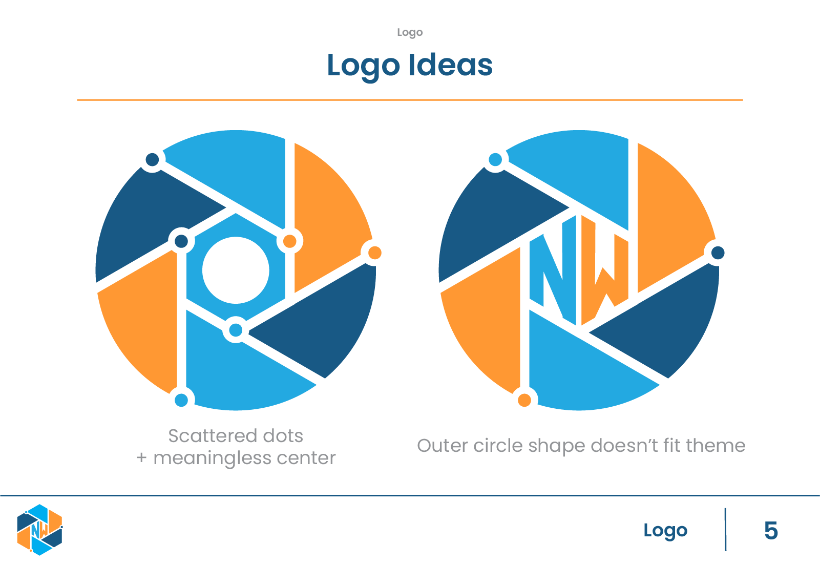
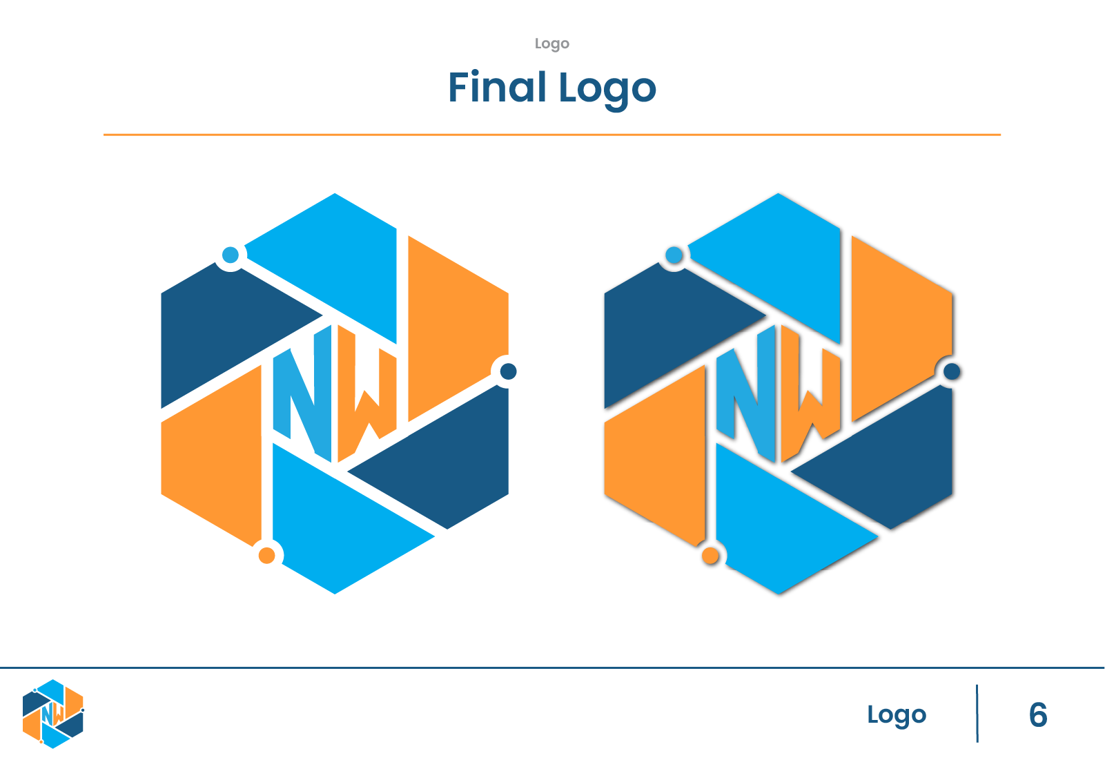
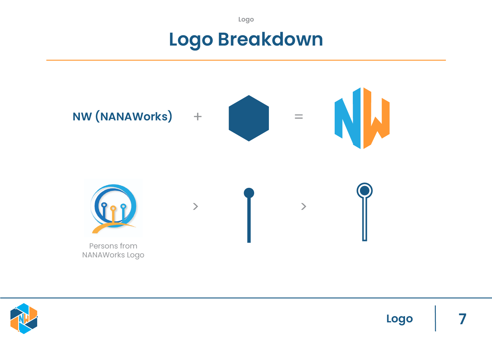
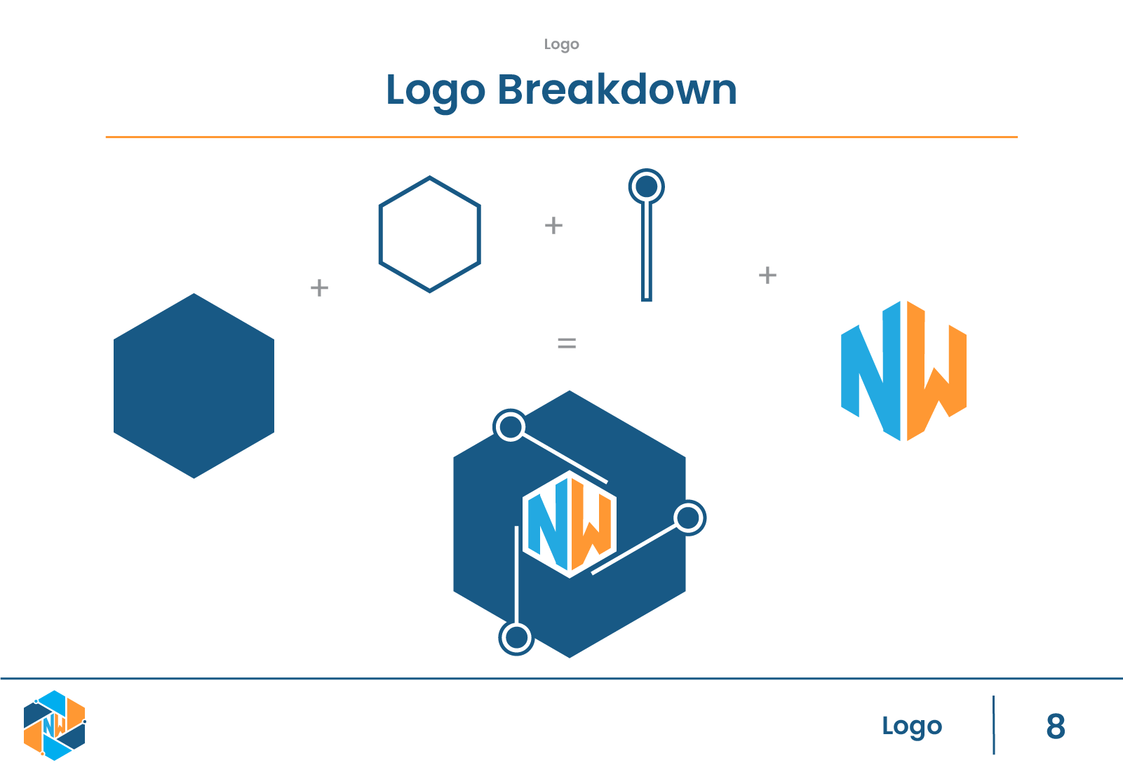
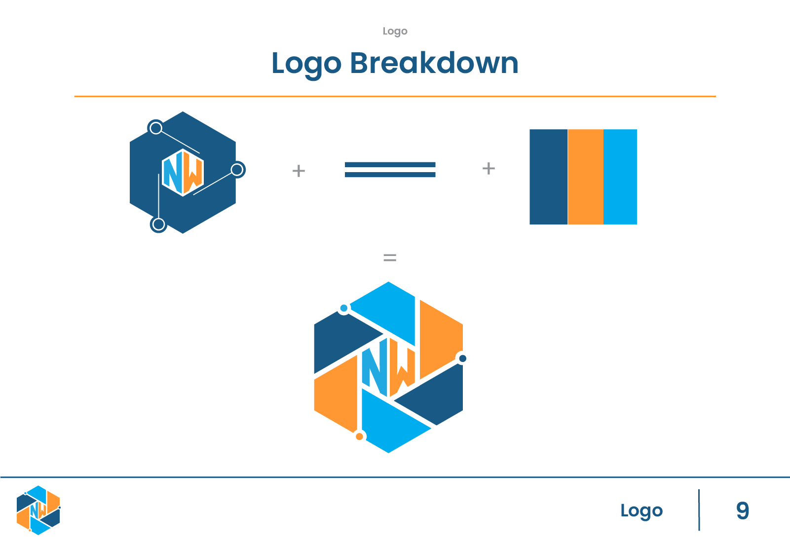
Logo Design
The logo was designed from the ground up to be flexible across digital contexts, including app navigation, onboarding screens, and documentation. I focused on simplicity and balance so the logo would remain legible at small sizes while still feeling intentional and professional.
Rather than treating the logo as a standalone mark, I tested it within realistic layouts to ensure it worked as part of a broader system.
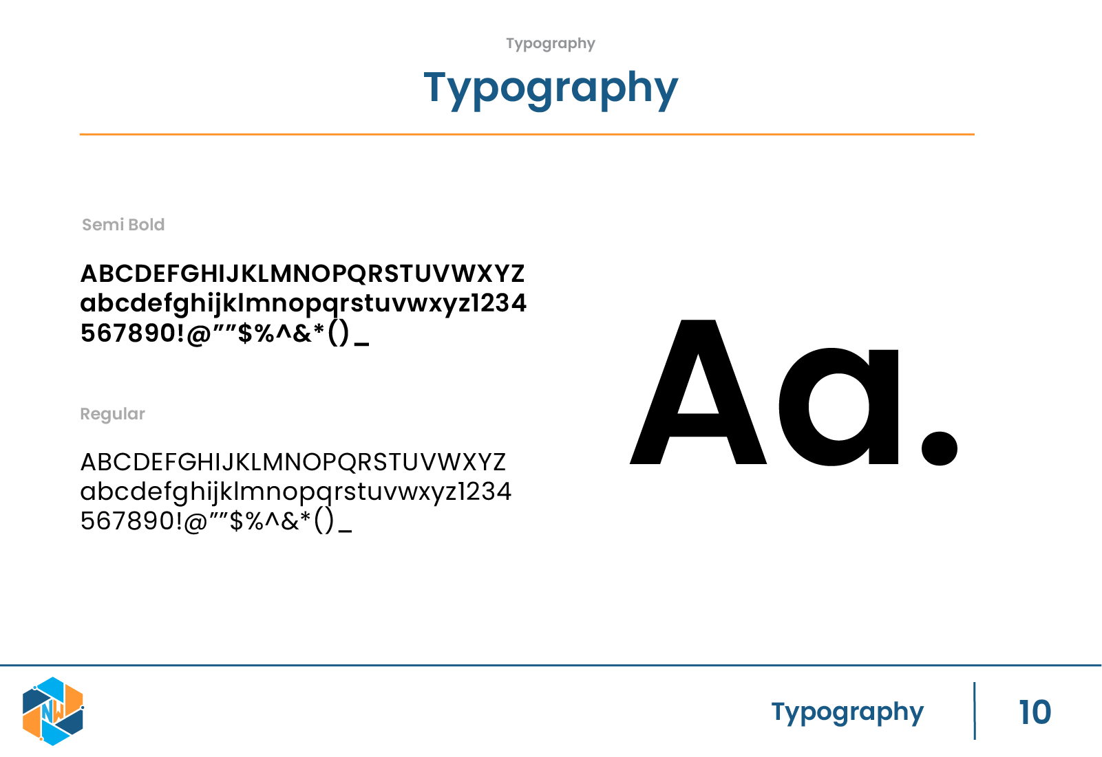
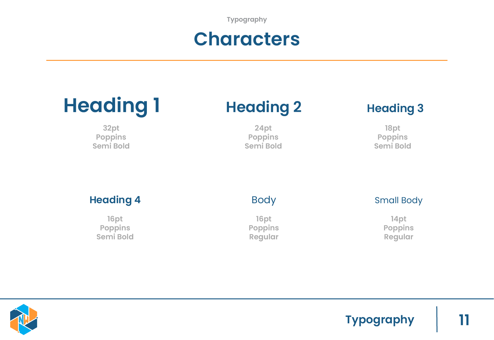
Typography
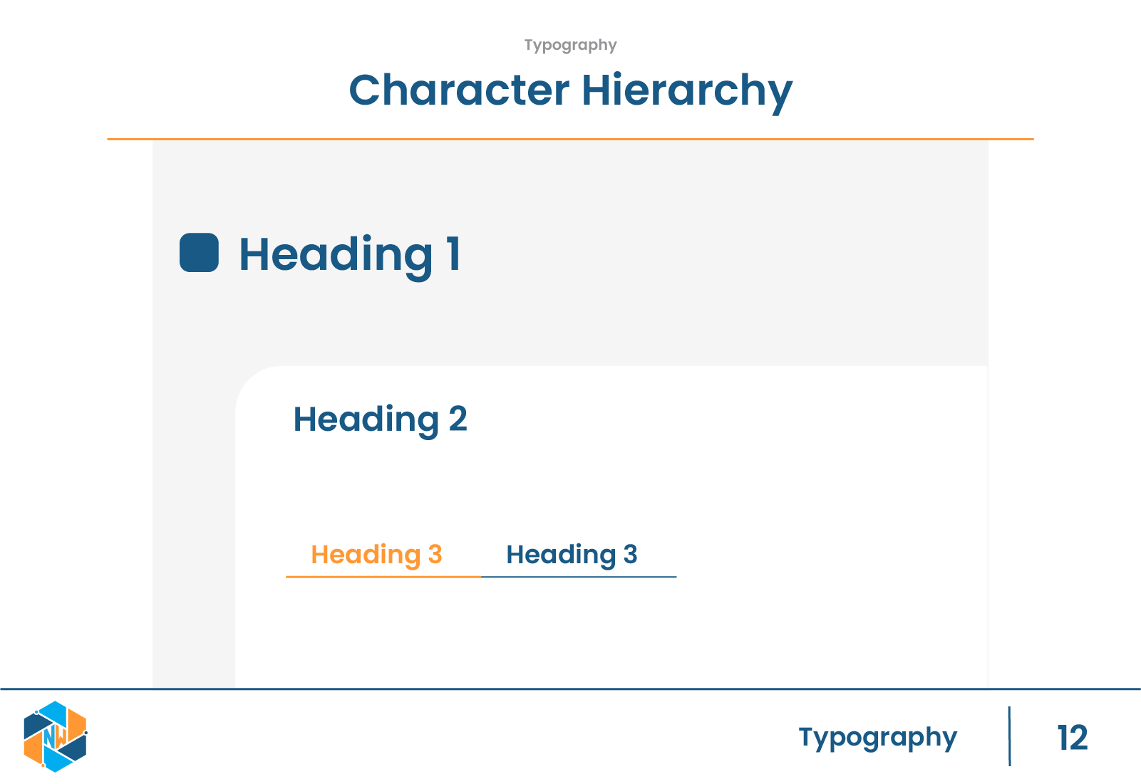
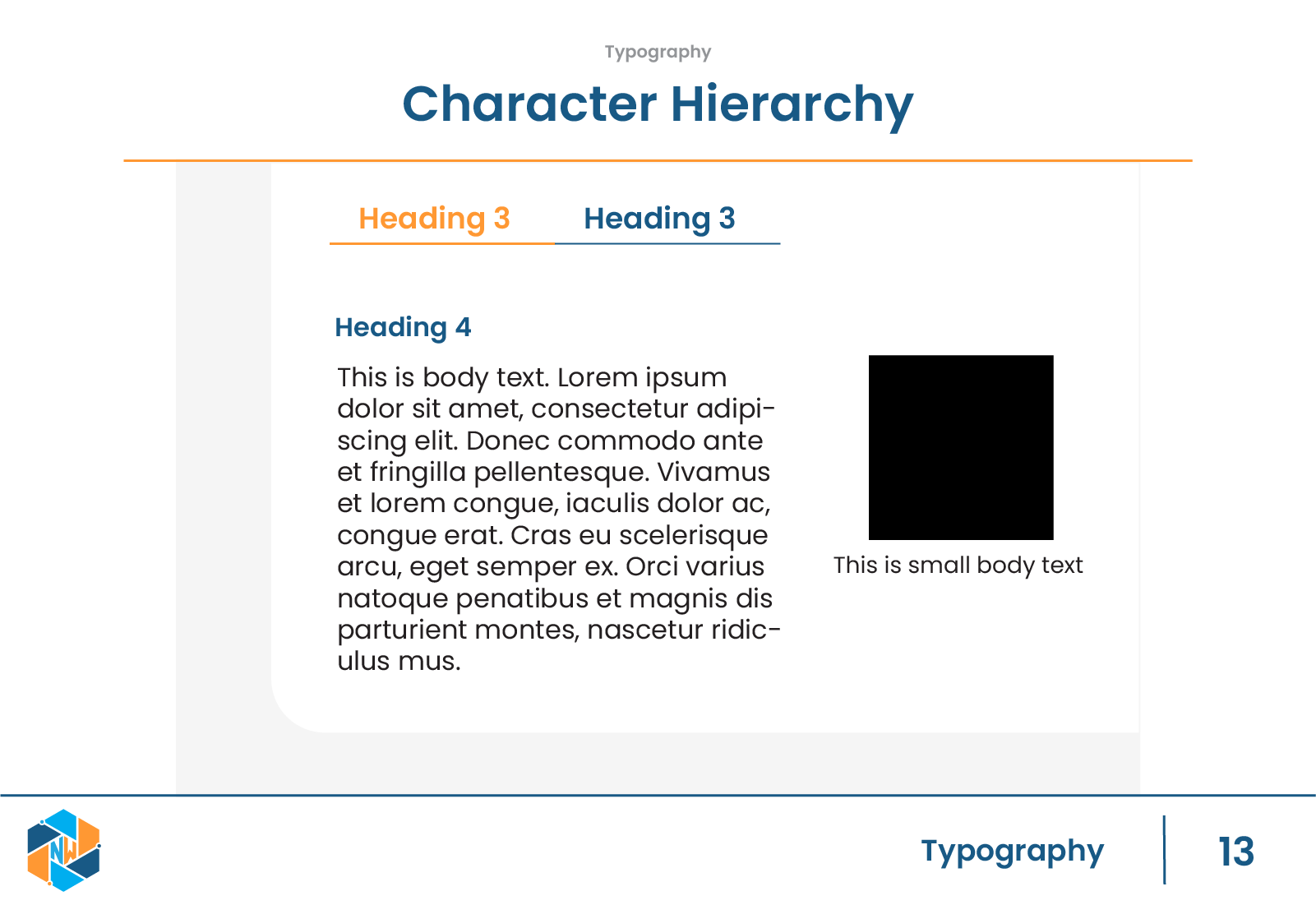
Typography plays a major role in usability, especially in a platform that includes reading, guidance, and structured content. I defined a typographic system that supports clear scanning and predictable hierarchy.
Headings, body text, and supporting content were given explicit roles to ensure consistency across product screens and brand materials.

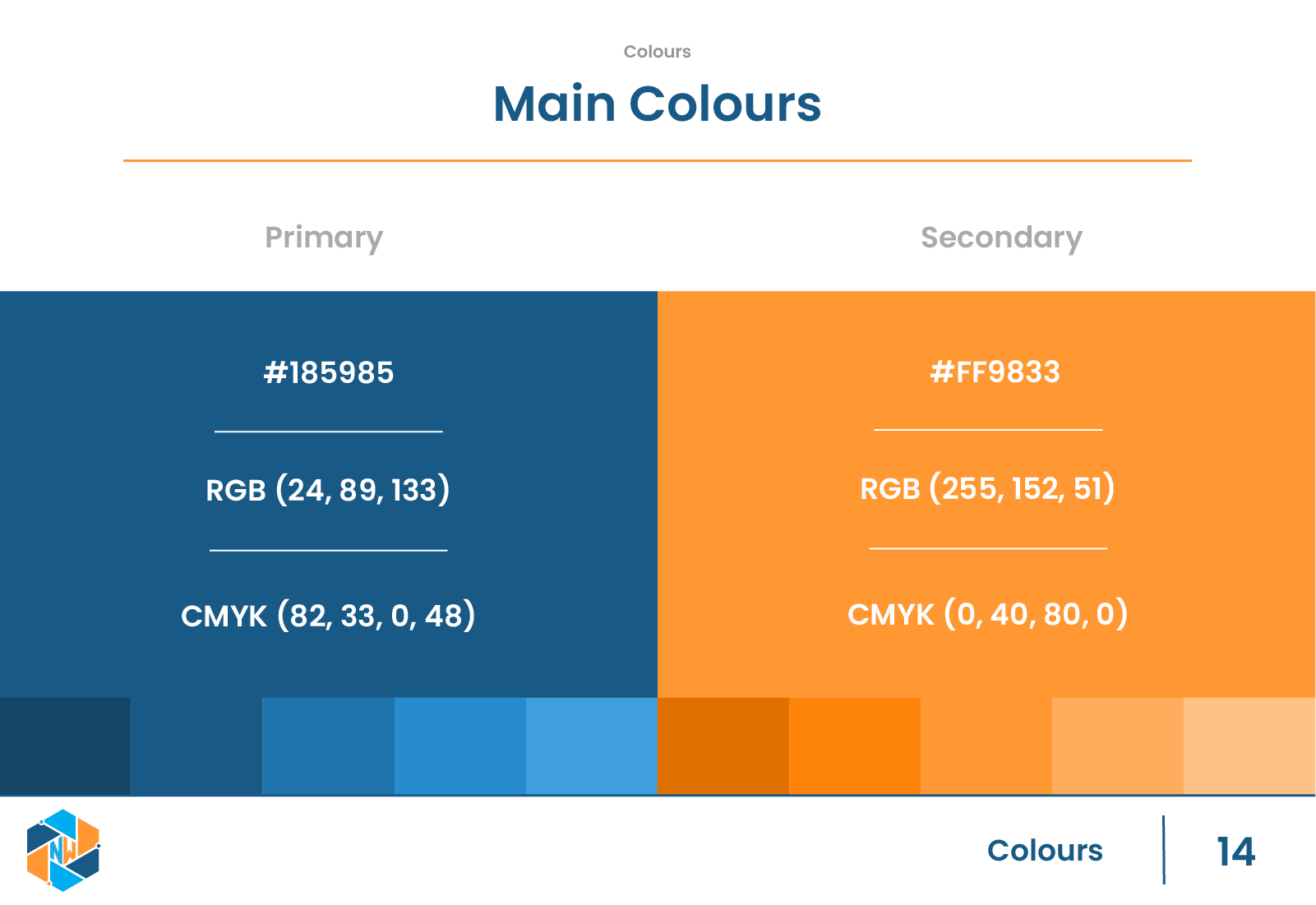
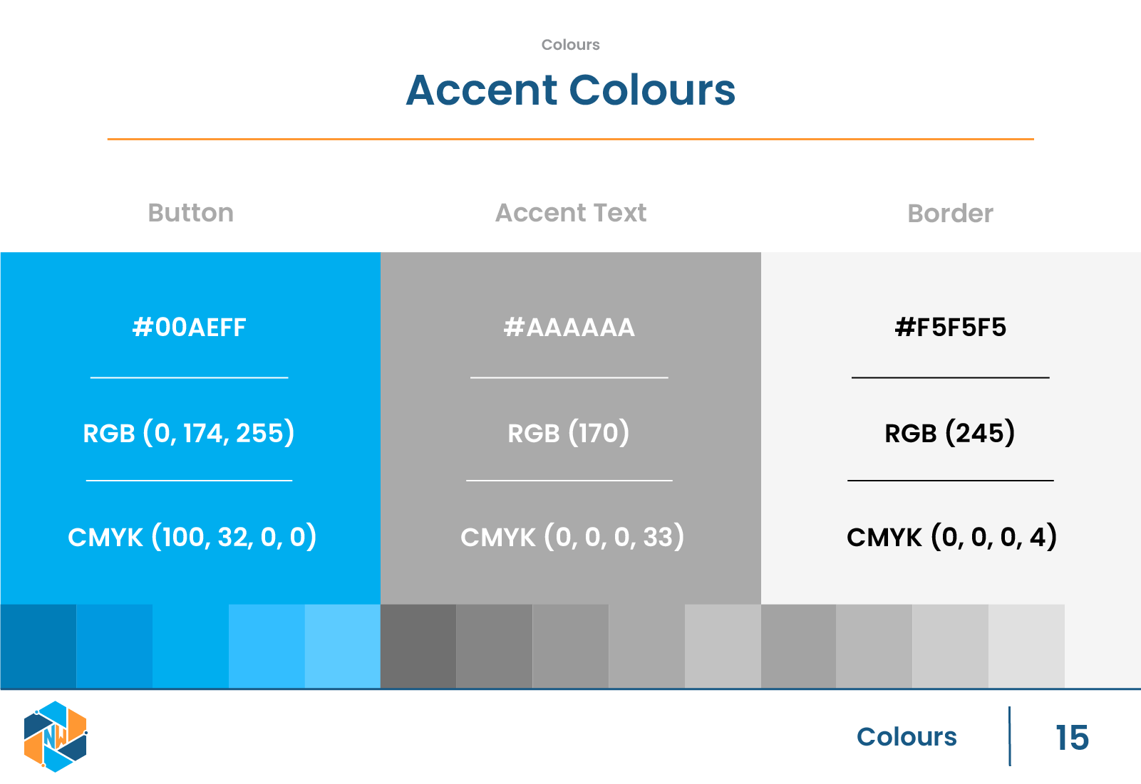
Colour System
The color palette was designed to feel approachable while maintaining strong contrast and clarity. I defined primary and secondary colors along with neutral tones that could support UI layouts without overwhelming users.
Accessibility considerations influenced contrast ratios and usage rules, ensuring the system could be applied confidently across different contexts.

Brand Guide Purpose
To make the identity usable beyond this project, I created a structured brand guide outlining:
-
Brand purpose and intent
-
Logo construction and spacing
-
Typography hierarchy and usage
-
Character hierarchy and tone
-
Color rules and applications
The goal was to reduce ambiguity and allow future designers or team members to apply the system consistently without reinterpreting design decisions.
Outcome
The final brand guide established a clear identity for NANAWorks and provided a foundation for consistent product and marketing design. While the platform did not reach a public launch, the brand system successfully translated abstract values into a structured, usable design framework.
This project reinforced the importance of systems thinking in product design. Even without a finished product, a strong brand identity can shape how users feel, navigate, and trust a platform.
Figma Mockups
UI Application
Early app mockups were created using the brand system to test how the identity translated into product UI. While these screens are no longer in development, the system was intentionally designed to integrate smoothly into interface design without losing clarity or consistency.
Mockup Gallery